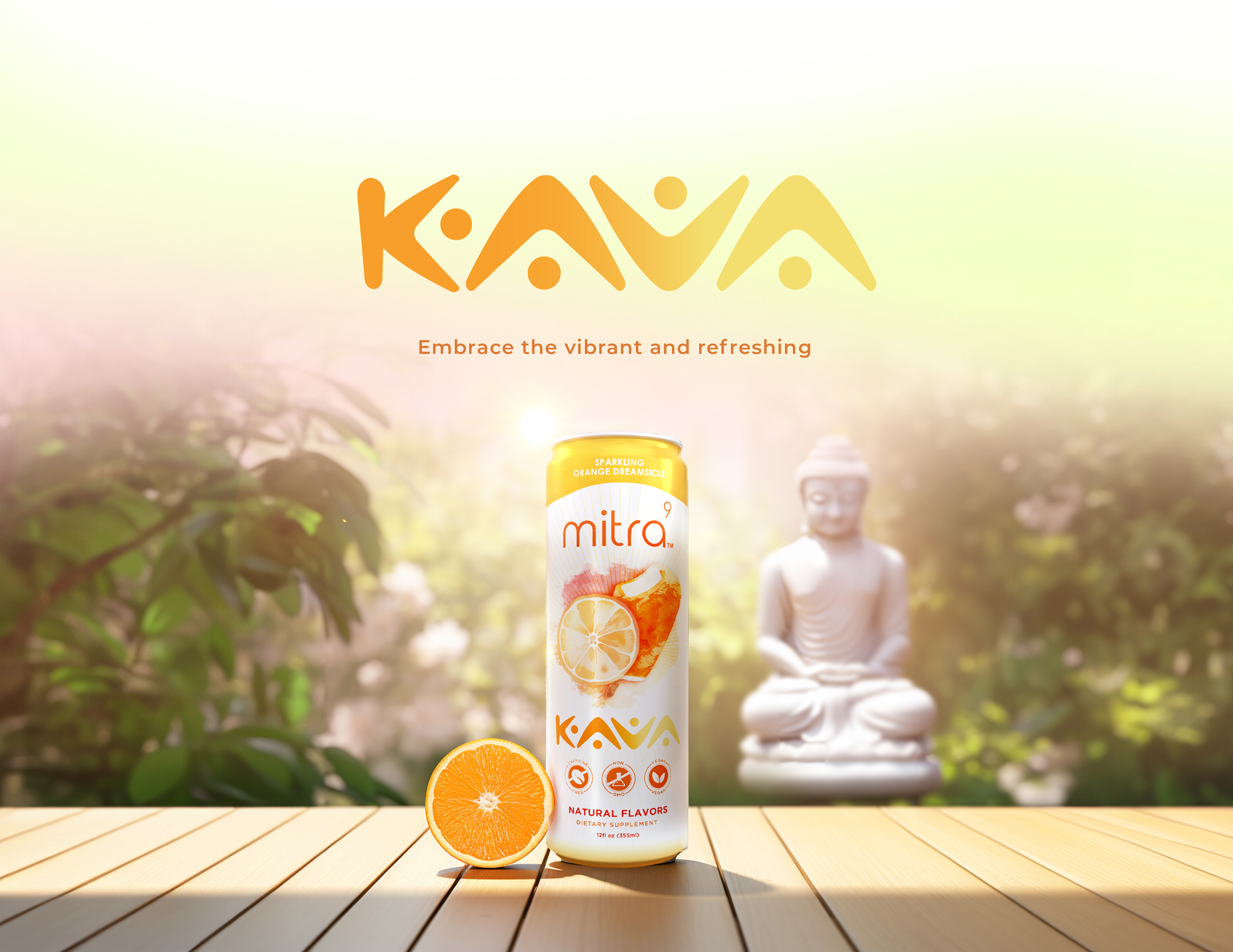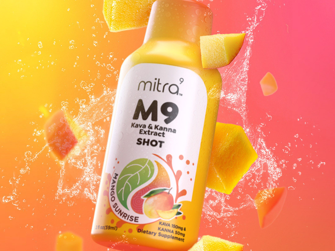
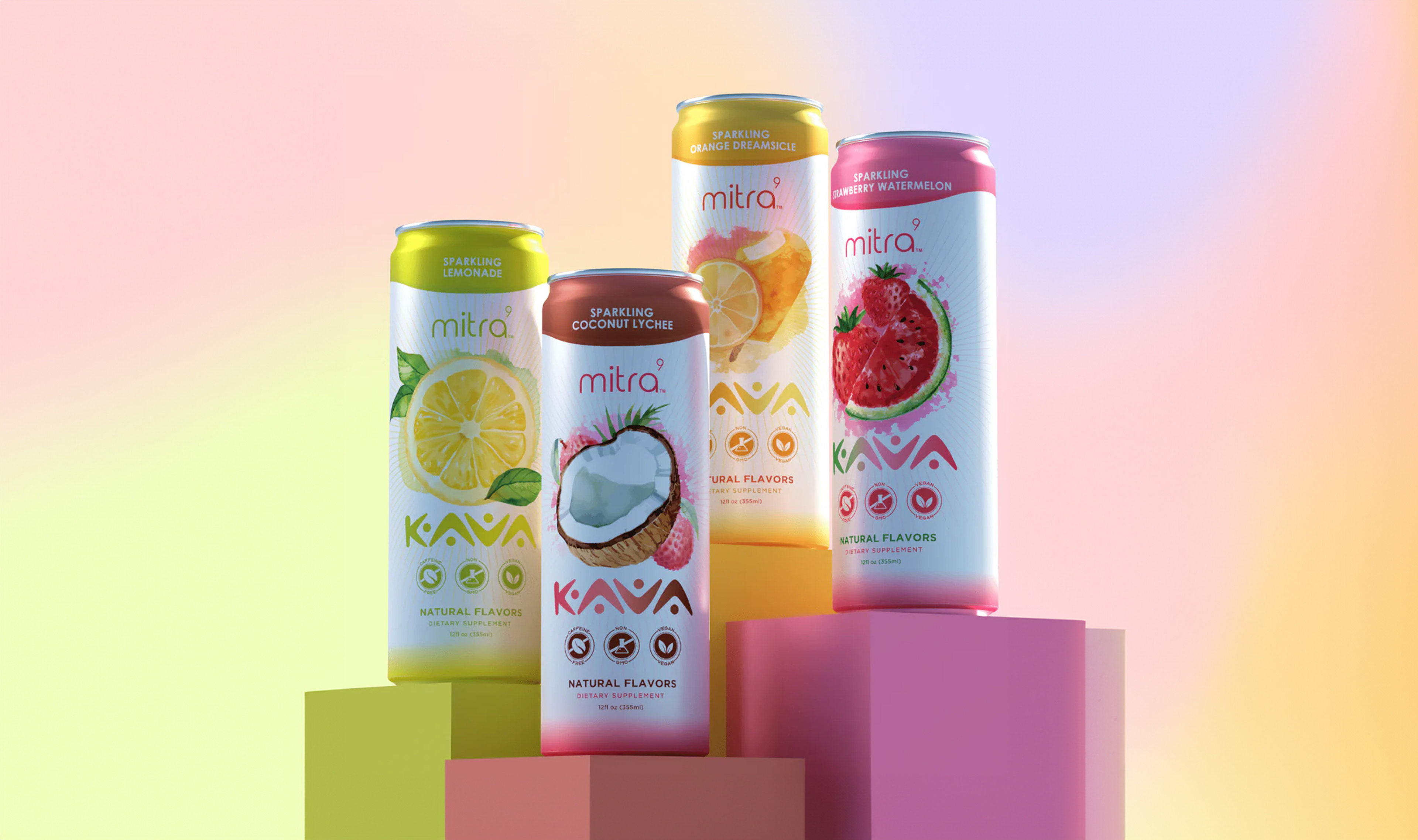


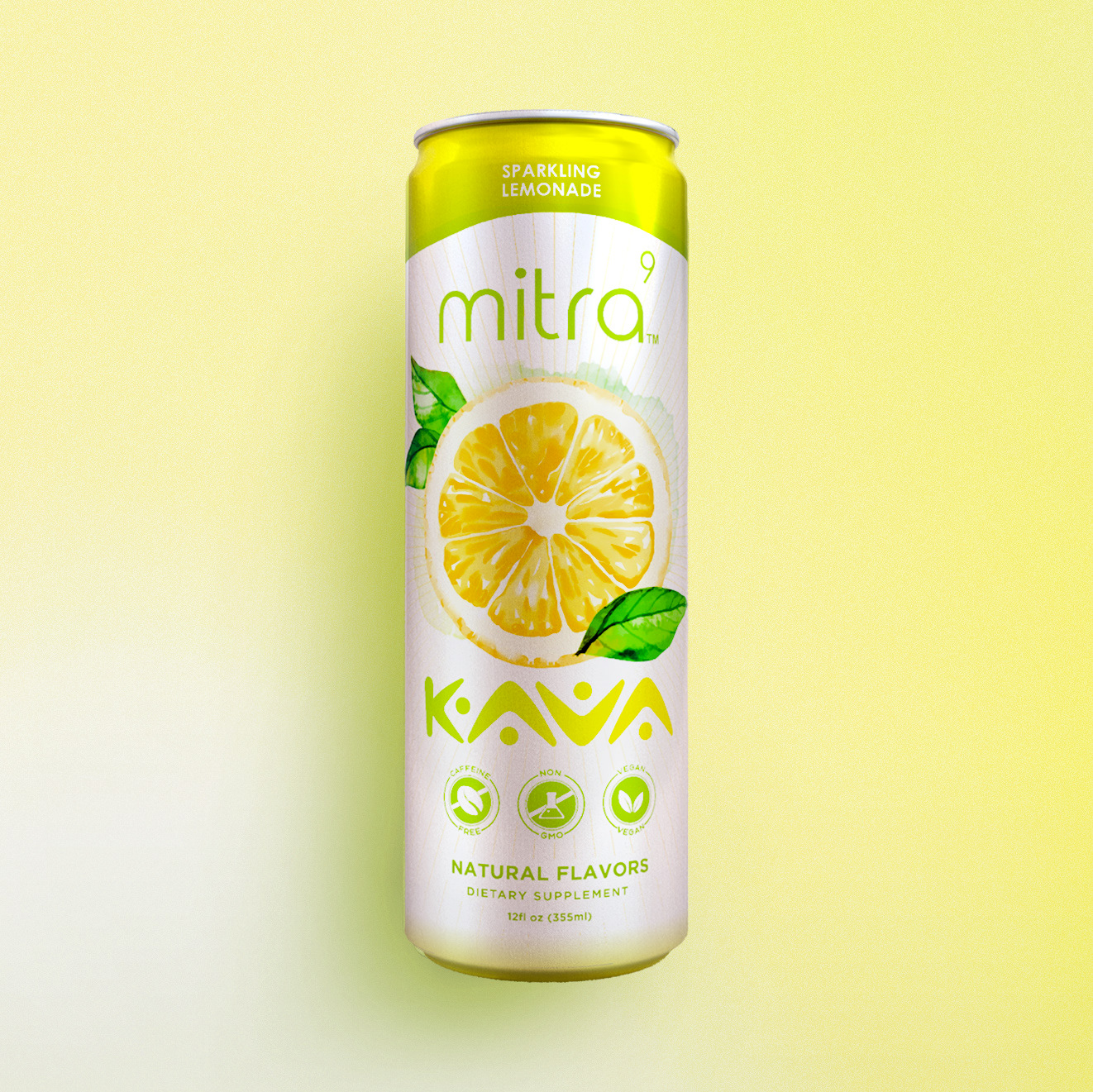

This project revolves around designing the label for a product line featuring four distinct flavors of kava-infused beverages. The objective was to create packaging that retains the essence of the "Mitra9" brand, which embodies good vibes, fruity flavors, and a clean, concise concept. Our aim was to craft a visually appealing label that resonates with consumers seeking a refreshing and uplifting drink experience.
Concept and Approach:
Good Vibes: The label design was inspired by the essence of "Mitra9," emphasizing positivity and a sense of well-being. We incorporated elements that evoke feelings of relaxation and joy, aligning with the calming and mood-enhancing properties of kava.
Fruity Flavors: Each flavor in the product line is represented by vibrant, fruit-inspired graphics and colors. The design visually communicates the refreshing and natural essence of the beverages, making it easy for consumers to identify their preferred flavor.
Clean and Concise: We maintained a minimalist approach to the overall design, ensuring it is straightforward and easy to understand. The layout is uncluttered, with clear typography and visually appealing icons that highlight the key attributes of the product.
Color Palette: The color scheme for the labels is bright and lively, reflecting the fruity flavors of the beverages. Each flavor is distinguished by its own unique color, creating a cohesive yet distinct look across the product line. Soft gradients and subtle patterns enhance the visual appeal while maintaining a clean and modern aesthetic.
Brand Consistency: Throughout the design process, we ensured that the packaging remains true to the "Mitra9" brand identity. The label design seamlessly integrates the brand’s logo and signature elements, reinforcing brand recognition and loyalty.